DESIGN PRINCIPLES - EXERCISES
11 Jan 2023 ~ 18 Jan 2023 / Week 1 ~ Week 2
Lee Kai Jin / 0354707 / Bachelors of Mass Communication (Hons) (Digital Media
Production)
Design Principles / Taylor's University
Task (Exercises / Project):
Exercises
LECTURES
Short Note for Design Principles
Contrast
 |
| Fig. L_1.0, Visual example of contrast, week 1 |
- combination of very different elements
- emphasise the elements that we wish to highlight (usually using colour)
Gestalt Theory
 |
| Fig. L_1.1, Visual example of Gestalt Principles, week 1 |
- human brain will automatically divide a artwork/design into simpler patterns or structure
- complex scenes can be reduced into simple shapes even though the elements are separated
- the Gestalt Theory includes:
- Principle of Similarity
- the human eye will see similar elements in a design as a whole
- the brain seems to link between similar elements
- Principle of Continuation
- the human eye follows the paths, lines and curves of a design as "reading" habit
- Principle of Closure
- human eye prefer to see complete shapes
- the brain will imagine a complete shape by filling in missing visual information
- Principle of Proximity
- related design elements are placed together
- Principle of Figure/Ground
- instinctively, things are viewed as either being in the foreground or the background.
- Law of Symmetry & Order
- elements that are symmetrical to one another are frequently seen as a single entity.
- emphasise more on symmetry compared with the Principle of Similarity
Balance
 |
| Fig. L_1.2, Visual example of balance, week 1 |
- distribution of visual weight in a design
- can be symmetrical or asymmetrical
- common theories included The Golden Ratio and Rule of Thirds
Emphasis
 |
| Fig. L_1.3, Visual example of emphasis, week 1 |
- similar to "contrast", it is used to create dominance or focus on an element
- elements can be used such as colour, shape, etc.
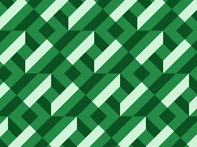
Repetition
 |
| Fig. L_1.4, Visual example of repetition, week 1 |
- repeats elements to creates rhythm and pattern
- sometime variety is essential to keep the design exciting and active
Movement
 |
| Fig. L_1.5, Visual example of movement, week 1 |
- the path a design takes the viewer's eye through a composition
- when items in a visual image appear to be moving
Alignment
 |
| Fig. L_1.6, Visual example of alignment, week 1 |
- creates a sense of unity and cohesion
- lead a person in "reading" the design
Harmony & Unity
 |
| Fig. L_1.7, Visual example of harmony & unity, week 1 |
- all the elements fit together in the same theme, aesthetic or mood
- Unity
- repetition of particular elements throughout the design
- balance and give a sense of oneness
Scale and Proportion
 |
| Fig. L_1.8, Visual example of scale & proportion, week 1 |
- Scale
- size of one object in relation to other objects
- can be visualise in actual measurement or visual estimates based on comparison
- Proportion
- the size of the parts of an object in relationship to other parts of the same object
- when there is a proper size or quantity relationship between the elements, proportion is harmonic
Symbol
- a sign, shape or object that is used to represent something
- convey information, equivalent to one or more sentences of text, or even a whole story
- Pictorial Symbols
- image-related and simplified pictures
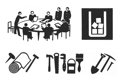 |
| Fig. L_1.9, Visual example of pictorial symbols, week 1 |
- represent but less details of something
| Fig. L_1.10, Visual example of abstract symbols, week 1 |
- have no resemblance at all to the objects or ideas represent
- we have to learn it
- based on geometric shapes and colours
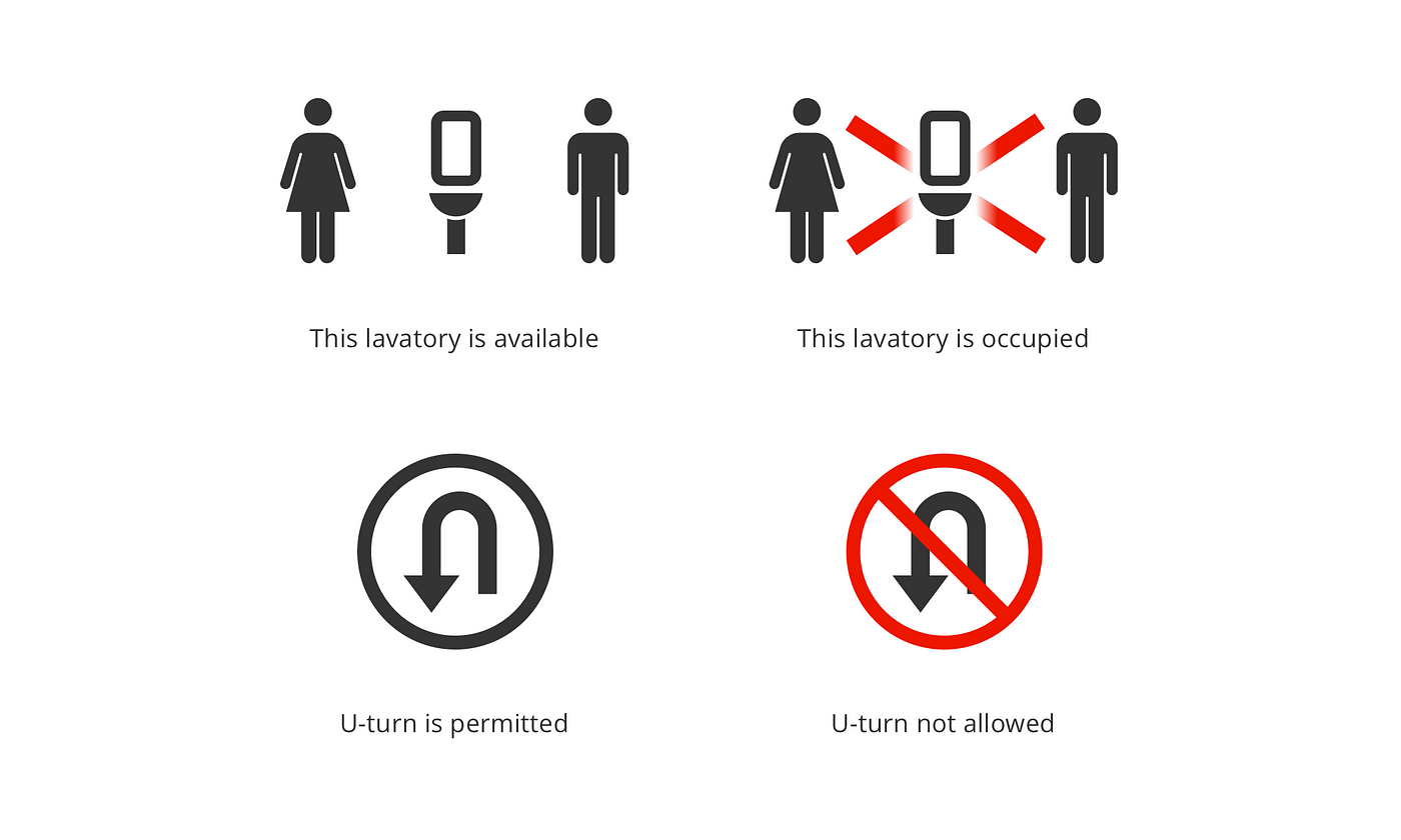 |
| Fig. L_1.11, Visual example of arbitrary symbols, week 1 |
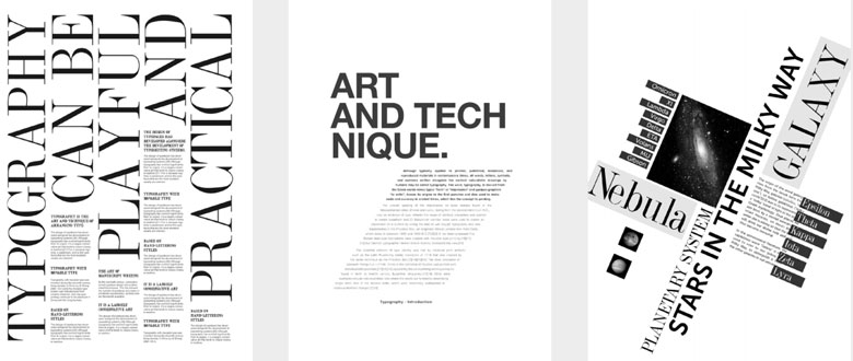
Word and Image
 |
| Fig. L_1.12, Visual example of word & image, week 1 |
- combination of word and image, widely used in designing a poster or advertisement
- the relationship between word and image should be relevant
Week 1 (Wed, 11 Jan 2023): Module introduction
Dr. Yip, our lecturer for the module explain to us about the module information. We are required to watch the pre-recording and pdf noted in order to start the exercise.
Week 2 (Wed, 18 Jan 2023): Exercise and e-portfolio review
The lecturer review and leave comment on our blog and exercise progress. She emphasise that the blog or e-portfolio is very important for us especially in design modules because it reflects our progress and it is a prove that we design something by our own, and a place for us to credit the original design (if any) and process of us got inspired from it. We should also label and caption properl all the reference such as images to clarify what is it for.
INSTRUCTIONS
EXERCISES
We are required to create/pick 2 design principles from the list below:
- Gestalt Theory
- Contrast
- Emphasis
- Balance
- Repetition
- Movement
- Harmony & Unity
- Symbol
- Word and Image
After studying the meaning of these elements, I decided to choose "emphasis" and "repetition" in this exercise.
Emphasis
My idea is to produce a design that emphasise the value of "be different to attract attention".
My idea come from human or animal are attracted by vivid colour compared with dim colour. Therefore, the plants are evolved to take this advantage in producing the fruits (medium to carry the seed). When the fruit (seed) is ready to spread and grow new tree, it will turns into vivid colour and sweet smell to attract moving living things such as human or animals to carry or eat it for the plants' reproduction.
The most common example of this is apple, the most famous fruit that can be see word wide, it is one of the best character to represent "fruit".
I love simple and minimal design so I prefer not to put too much shadow or details in my artwork. Therefore, I refer the logo of Apple Inc. to study the feature and how to I present "apple" in the most minimal way.
| Fig. I_1.0, Apple Inc. logo, week 1 |
I draft the apple using Procreate.
 |
| Fig. I_1.1, Draft of apple, week 1 |
I personally love the apple with only one stroke and it somehow make the design not too boring compared with plain shape at it can emphasis on the shape of the apple and make it a little bit 3D, so I use it in my design.
I design my final artwork using Adobe Illustrator (AI).
 |
| Fig. I_1.2, Tracing the apple from my draft in Adobe AI, week 1 |
 |
| Fig. I_1.3, Result of tracing, week 1 |
I am not satisfied with the outcome so I decided to draw the apple in another way.
 |
| Fig. I_1.4, Design the apple using pathfinder, week 1 |
 |
| Fig. I_1.5, Final outcome of apple, week 1 |
 |
| Fig. I_1.6, Experimenting different kind of stroke, week 1 |
I prefer the second one so I will use it in my final design.
 |
| Fig. I_1.7, Duplicate the apple and make it in different colour, week 1 |
 |
| Fig. I_1.8, First design of "Emphasis", week 1 |
After showing the design to Dr Yip, she suggest to thicker the line of the red apple and put a plain colour background to make it not so "boring".
Repetition
I have obsessive compulsive disorder (OCD) (for real) so I feel satisfied and comfortable with artwork or design that practice repetition and symmetry. While I was in secondary school, I am in love with things with repeating pattern and almost all my belongings such as phone case, stationary case, bags and shirts are in these kind of patterns. I also love to draw repetition pattern as decoration in my paper project or anything else.
One of my favourite is the pattern that plain, do not have border and made out of simple pixelated shapes. For example:
 |
| Fig. I_1.9, Example of design, week 1 |
 |
| Fig. I_1.10, Basic shape of the design, week 1 |
 |
| Fig. I_1.11, Repeating the shape, week 1 |
 |
| Fig. I_1.12, Colouring, week 1 |
 |
| Fig. I_1.13, First design of "Repetition", week 1 |
After showing Dr Yip the design, she suggest to make more variety on the design as it looks too simple.
Final Submission of Exercise:
 |
| Final Submission of "Emphasis" in JPEG |
Final Submission of "Emphasis" in PDF
Rationale of this design: Emphasis
Human or animal are attracted by vivid colour compared with dim colour. Therefore, the plants are evolved to take this advantage in producing the fruits (medium to carry the seed). When the fruit (seed) is ready to spread and grow new tree, it will turns into vivid colour and sweet smell to attract moving living things such as human or animals to carry or eat it for the plants' reproduction.
 |
| Final Submission of "Repetition" in JPEG |
Final Submission of "Repetition" in PDF
Rationale of the design: Repetition
A repeating pattern that brings out we can produce (or visually see) one shape can become another shape with the help of colour difference. For example, in this design, we can see 3D circle but it only consist of right triangle.
FEEDBACK
Week 2: Feedback
General Feedback:
Emphasis: Fulfil the principle, can be better to avoid the design too "boring".
Repetition: Make more variety in the design.
Specific Feedback:
Emphasis: Thicker the line of red apple and add background.
Repetition: Use the pattern to make a design, example make some white space between pattern or refer to the logo/pattern on shirt (leave some blank space and smaller the logo/pattern).
REFLECTIONS
Experience:
It is a weird that this module (Design Principles) is not the first design subject I took and I somewhat back to the basic theories in design.
Observations:
Even though this module is somewhat easier than other design module I took but there is never a cap for studying new knowledge.
Findings:
There's always room of improvement, never be pride on own skills!
FURTHER READING
The Design of Everyday Things by Don Norman
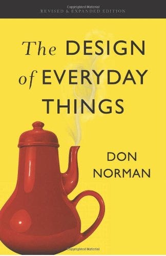 |
| Fig. FR_1.0, The Design of Everyday Things |
This book explain and demonstrate about why the everyday product around us that we use everyday is design like that. For example, the door, cutleries, furniture, electrical products and so on. It explain the general or universal development that finally standardise the design of the products surrounding.

Comments
Post a Comment