TYPOGRAPHY - TASK 2 - Typographic Exploration & Communication
25 Apr ~ 21 May / Week 6 ~ Week 8
Lee Kai Jin / 0354707 / Bachelors of Mass Communication (Hons) (Digital Media
Production)
Typography / Taylor's University
Task (Exercises / Project):
Task 2: Typographic Exploration & Communication
INSTRUCTIONS
Task 2: Project 1
Week 6 (Tue, 26 Apr 2022):
We are required to start a new task which is about combination of application of Adobe Illustrator (AI) and Adobe InDesign (ID). We should apply the skill and knowledges we learned and apply on this two page 200mm x 200mm project.
First at first, I need to create a design for headline using Adobe AI.
 |
| Fig. I_6.0, Designing headline using Adobe AI, Week 6 (26 Apr 2022) |
My idea is emphasise the word "visual" using bigger font and shadow, and mask the word "world" in the circle which represent the Earth. I rotate the "world" 30 degree to make the design more attractive and more like the Earth.
 |
| Fig. I_6.1, Designing headline using Adobe AI, Week 6 (26 Apr 2022) |
 |
| Fig. I_6.2, Final design of headline, Week 6 (26 Apr 2022) |
After the final design of the headline, it is time to import it into the Adobe ID.
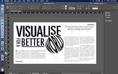
First at first, I import all the copywriting into Adobe ID and slowly adjust the layout, typeface, font size and so on.
 |
| Fig. I_6.4, Importing text, Week 6 (26 Apr 2022) |
I found out that it is a bit "boring" to use the layout like that so I decided to make it look like this:
 |
| Fig. I_6.5, Changing the layout of the copywriting, Week 6 (26 Apr 2022) |
Below is my first final draft waiting for review.
 |
| Fig. I_6.6, First draft waiting for feedback, Week 6 (26 Apr 2022) |
Week 7 (Tue, 10 May 2022):
It was Hari Raya Aidilfitri semester break last week. After Mr Vinod viewing my design, she mentioned that overall is very good but be aware on the copywriting because some of it is too tight and some of it is too loose, need some adjustment.
Therefore, I took some time to adjust again the font size so that the overall layout looks neat and clear.
Final Submission:
 |
| Final submission of Task 2: Project 1 (.jpeg), Week 7 (10 May 2022) |
Final submission of Task 2: Project 1 (.pdf), Week 7 (10 May 2022)
FEEDBACK
Week 7: Text Formatting
General Feedback: Overall it is very good, the presentation is clear and direct.
Specific Feedback: Need some adjustment on the copywriting because some of the line looks too tight and some of it looks too loose.
REFLECTIONS
Experience:
I am really enjoying in creating design during this task. It give me sense of achievement after seeing the final outcome of mine.
Observations:
While doing the task, I need to always concern about is the design looks clear, neat, direct in presenting idea and easy to read. Sometime I need to let others (especially people who are not in this field) to review on the design because sometime we forgot things and sometime that was a huge obvious problem just that we are "ignoring" it because we are staring on it for too long and we are used to it.
Findings:
It is not easy to become a typographer, it took me a lot of time in designing this two pages design, can't imagine how those professional design out a book or magazine just between a short period.
FURTHER READING
Thinking with type: A Critical Guide for Designers, Writers, Editors, & Students
 |
| Fig. FR_1.0, Front cover of Thinking with type: A Critical Guide for Designers, Writers, Editors, & Students |
Some says that this is the best book to have a look for beginners. This book shows a lot of example around the world (mainly the Western) about layout, application on typefaces, creative design on printed media.


Comments
Post a Comment