DESIGN PRINCIPLES - FINAL PROJECT - VISUAL ANALYSIS
1 Feb 2023 ~ ? Feb 2023 / Week 4 ~ Week 7
Lee Kai Jin / 0354707 / Bachelors of Mass Communication (Hons) (Digital Media
Production)
Design Principles / Taylor's University
Task (Exercises / Project):
Final Project - Visual Analysis
LECTURES
Week 4 (Wed, 1 Feb 2023): Module Introduction
Assignment brief for the final project.
Week 5 (Wed, 8 Feb 2023): Progress Review
Review and consultant session for the assignment.
Week 6 (Wed, 15 Feb 2023): Progress Review
Absent.
Week 7 (Wed, 22 Feb 2023): Progress Review
Review and consultant session for the assignment.
INSTRUCTIONS
Final Project - Visual Analysis
For this task, we are required to utilise the understanding of design principles found in design work. We should pick one goal out of 17 goals from the United Nations' Sustainable Development Goals (UNSDG), select an art or design that revolves the particular goal and do a visual analysis of the selected design. After the visual analysis, we should create a design by inspired or react to the one we analysed.
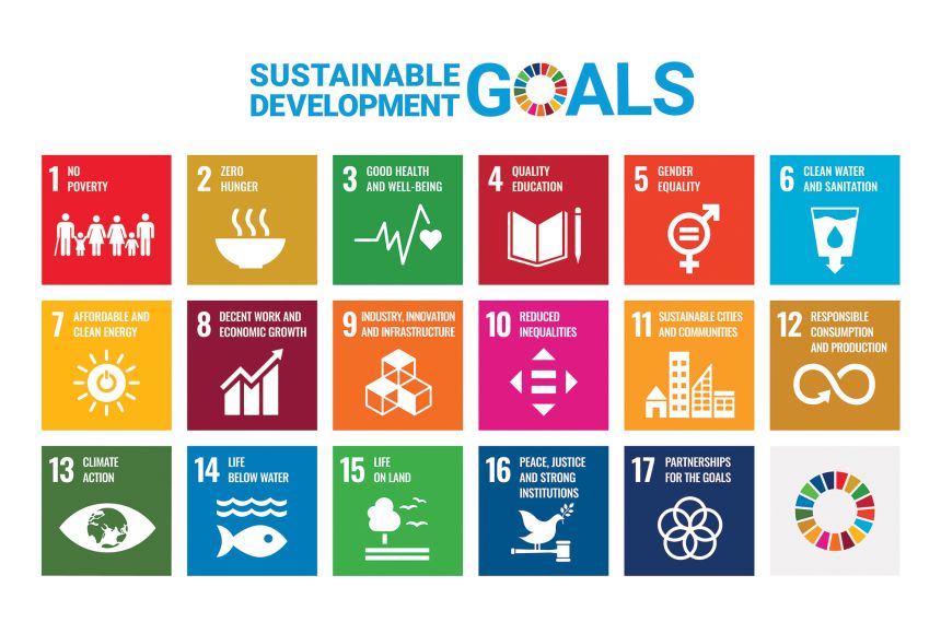 |
| Fig. I_4.0, 17 UNSDG (Week 4) E-SDGs-Poster-801x476.png Source: United Nations (2022) United Nations' Sustainable Development Goals. Retrieved from https://sdgs.un.org/goals |
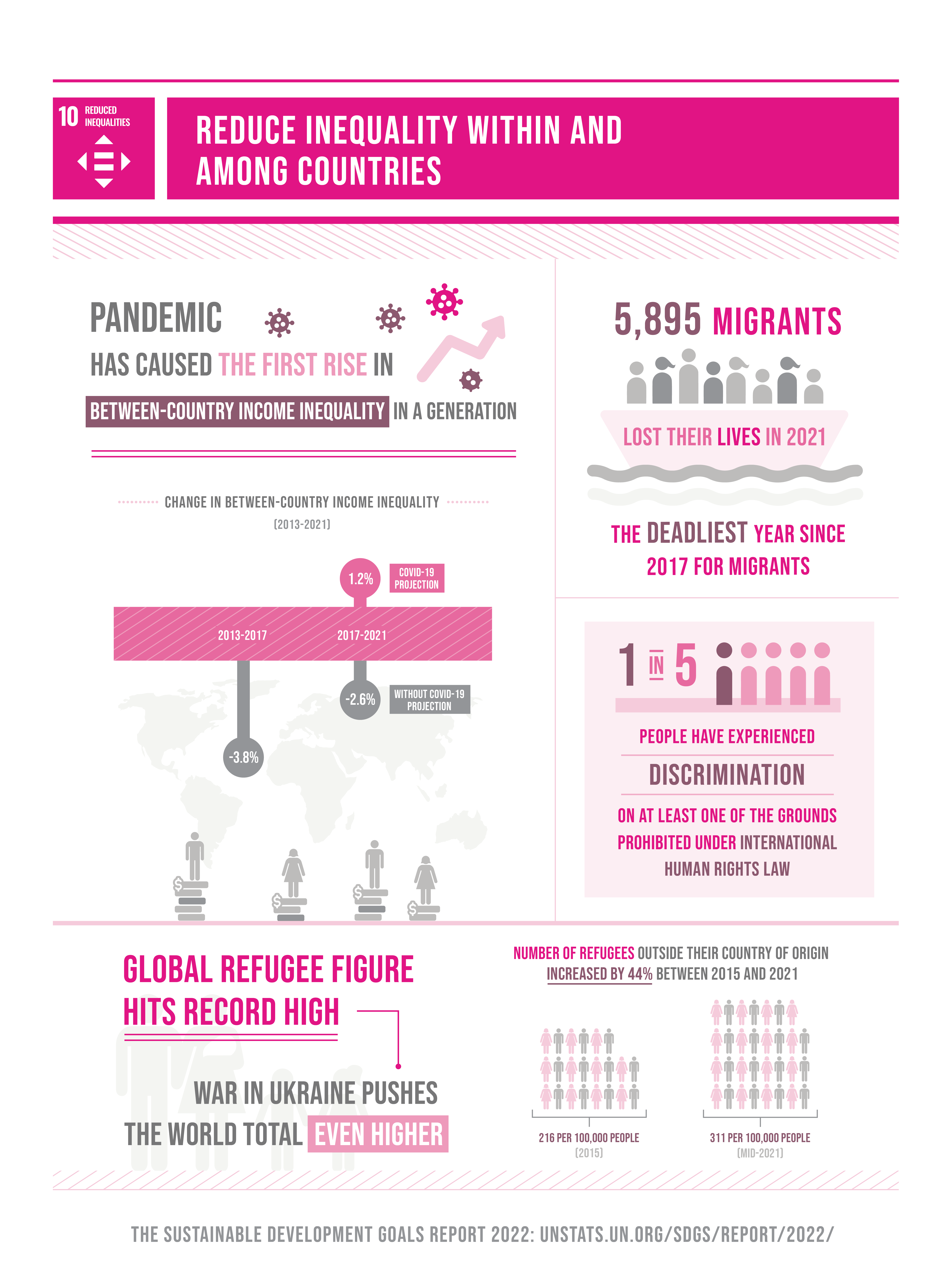 |
| Fig. I_4.1, Goal 10: Reduced Inequalities (Week 4) SDG Report 2022_Goal 10 infographic.png Source: United Nations (2022) Reduce inequality within and among countries. Retrieved from https://sdgs.un.org/goals/goal10 |
In this century, there are a lot of revolution including but not limited to protest, law, idea or mindset and more that emphasised in this topic, mainly in reducing discrimination in any form such as racism, sexism, religious discrimination, social status discrimination and more. It is important for everyone to take attention on this topic as we should practice the idea of everyone is equal and should have equal rights as a human being.
In my opinion, this should be emphasised because there is still some issues happening in Malaysia and some of the people might not get equal rights on some certain aspect. Even though I am lucky that I did not experience much regarding inequalities but I would like to take this opportunity to spread awareness among Malaysian and born new society that free from inequality.
Below is the illustation I chose for visual analysis.
 |
| Fig. I_4.2, Poster of Reduced Inequalities by Christoph J Keliner (Week 4) maxresdefault.jpg Source: Christoph J Keliner (2017) 100% Renewable Energy for Sustainable Development. Retrieved from https://www.youtube.com/watch?v=ejUojjU-Msc |
The main topic of this video is actually about renewable energy and how it helps in achieving the 17 UNSDG. Regarding to "Reduced Inequality", renewable energies are able to improve the infrastructure of rural region mainly in basic needs such as water and electricity which can effectively reduce the differences between rich and poor people also urban and rural regions.
Visual Analysis
Observation:
The first impression of this artwork for me is the main stream colour is brown, and the text in white in colour located at the top of the artwork. Overall, the artwork is in drawing and handwriting style. There is also a conspicuous pink circle with white text in the middle of the artwork. There is no clear or thick border for all the elements in the design but overall the usage of colour is clear and bright to separate from each other. There is white text at the top half of the artwork and the bottom half consist of four characters with different outfit labeled with different description sitting on the seesaw that is actually balance on a cone.
Analysis:
The design is symmetrically balanced. The artwork is separated into three spaces from up to down, which consist of the title, four characters (that is separated in equal and balance spaces too) and the seesaw and the ground. The emphasis is the pink circle that content the text of "10: Reduced Inequalities" which is the main topic. The white text is aligned at the middle top of the design and the text with pink circle is aligned at the centre. The colour usage is harmony with brownish colour theme but have contrast to separate from each other.
Interpretation:
The four characters sitting on the balanced seesaw symbolised "everyone is equal" and the characters is labeled with "poor", "urban", "rural" and "rich". We can actually see these through their outfit but the label makes the "description" of the characters clearer.
This design is actually the visual aids of a Youtube video by channel name "World Future Council" and the title of the video is "100% Renewable Energy for Sustainable Development" (Link: https://youtu.be/ejUojjU-Msc). The illustration is made by Christoph J Keliner from Studio Animanova. The video is actually explaining about the relation of the renewable energy and the UNSDG and how it brings benefit to it. The video explained that renewable energy is cost-efficient and able to improve the infrastructure mainly in water source and electricity which can effectively reduce the differences in terms of basic needs and resources.
Idea Exploration
After completed the visual analysis, it is time for idea exploration for my poster design regarding the topic above. I am trying to get some idea from the UN website regarding the topic of reduce inequalities.
 |
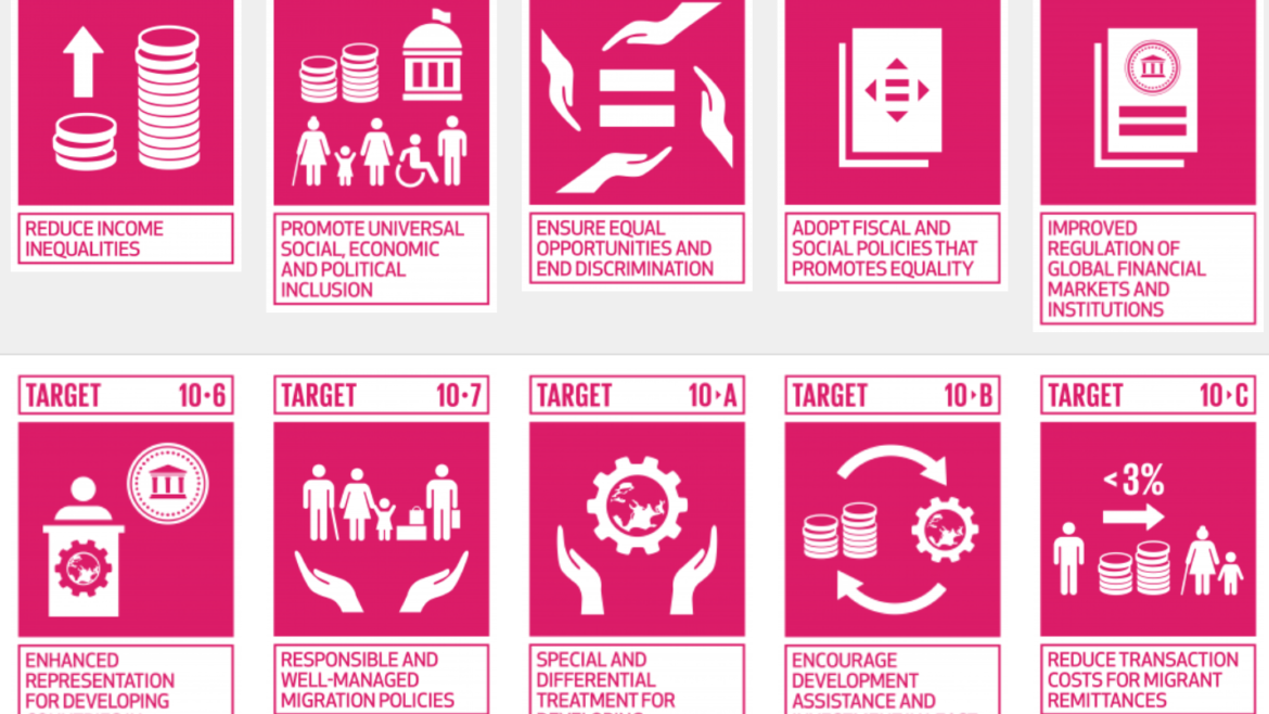
| Fig. I_5.0, Target in achieving reduce inequalities (Week 5) https://globalgoalsproject.eu/wp-content/uploads/2019/09/Screenshot-2019-09-17-at-12.51.54-1170x658.png Source: Global Goals (2022) Does SDG 10: Reduced Inequalities signify a new global norm?Retrieved from https://globalgoalsproject.eu/blog/2019/09/17/sdg-10-reduced-inequalities-new-global-norm/ |
In my opinion, the most major and important thing to do in achieving this goal is emphasizing on repeal the demographic status while offering a job position. For example, repeal the culture of takes gender, age, race and religion as one of the requirements but emphasize more one a person's ability and skill on the particular job position.
My idea is that emphasizing demographic status is not an issue achieving anything in a job position.
 |
| Fig. I_5.6, Draft of my design (Week 5) |
The idea of this design is that is a puzzle at the center of the poster, and the center piece is a most common and standard formal work attire (black blazer, white shirt and red tie), and the other pieces of puzzle will be 8 different figure or elements that represent different demographic background (for example ethic group and gender). all the 8 pieces of puzzles are in different shapes to represent diversity.
 |
| Fig. I_6.0, Layout design (Week 6) |
 |
| Fig. I_6.1, Design of formal working suit (Week 6) |
 |
| Fig. I_6.2, Designing other cultural element patterns, each of it represent Chinese, Dayak, Malay, Indian and Kadazan Dusun, the last one is smart casual attire for work (Week 6) |
I have an idea that instead of putting the formal working suit at the middle, I think it will be better if I design another one for woman working suit (represent gender equality in workplace) and replace the center puzzle with a company symbol instead.
 |
| Fig. I_6.3, Make it in "puzzle form" (Week 6) |
 |
| Fig. I_6.4, A simple company logo at the center (Week 6) |
 |
| Fig. I_6.5, Experimenting different design (Week 6) |
Since the puzzles are in different colours, so I think without border is the best and most harmony.
 |
| Fig. I_6.6, First design (Week 6) |
During the consultation session, Dr Yip suggest me to change the company symbol into text (title instead) and fill the background with some element. Also, I rearrange the artwork in the puzzles to make it looks neater and more comfortable.
 |
| Fig. I_7.0, Rearrange the puzzle pattern (Week 7) |
 |
| Fig. I_7.1, Create some smaller puzzle pieces as background (Week 7) |
 |
| Fig. I_7.2, Randomize the rotation of the puzzle pieces (Week 7) |
 |
| Fig. I_7.3, Use the puzzle pieces to fill up the blank spaces (Week 7) |
 |
| Fig. I_7.4, Colour the pieces with random colours (Week 7) |
Final Submission
 |
| Final Submission of Final Project - Visual Analysis in .jpeg format |
Final Submission of Final Project - Visual Analysis in .pdf format
Rationale of design:
Rationale of design:
The topic for the UNSDG I picked is "Goal 10: Reduce Inequality". In Malaysia, one of the common discrimination of inequality is in workplace, mainly gender and race inequality in a company. In this poster, there are text (title) that emphasizing "equal rights" at the middle and there is puzzles in the middle. The puzzles contain 9 pieces, the center one is the title with bold border and the outer 8 pieces surrounding are common formal and smart casual attire for office and patterns that represent different culture. The is a small subheadline stated "for all employees" as a replenish for the artwork theme, the company. The background or the spaces at the top and bottom of the poster is smaller puzzle pieces with different colours, which represent various types of people in the society. The message that I am trying to deliver is a company needs talent of everyone from different background to operate and everyone should be treat fairly,
The design principles contained in this poster are:
Balance & unity & repetition - geometrically balanced puzzle shape
Emphasis - the title and bolded puzzle pieces in the middle of the poster
FEEDBACK
Week 5: Feedback of Visual Analysis
General Feedback: Visual analysis well explained.
Specific Feedback: Just some amendment on language wise and add in some point, add more explanation on own opinion in the research progress.
Week 7: Feedback of Poster
General Feedback: Good idea expression.
Specific Feedback: Rearrange the layout. change the "company" logo into clearer symbol or text instead.
REFLECTIONS
Experience:
Through this project, I wish that the society can be more open minded, celebrate differences and produce a community that no discrimination, it is human basic rights to be treat fairly.
Observations:
While during research, I found out that discrimination of any kind is everywhere.
Findings:
There are a lot of issue that everyone in the Earth responsible to solve and it is not an small issue as it deeply affecting our society.
FURTHER READING
How Design Makes Us Think: And Feel and Do Things by Sean Adams
 |
| Fig. FR_1.0, Cover of How Design Makes Us Think: And Feel and Do Things by Sean Adams |
This book is about how the design directly affect the user or reader's feeling and trying to understand the message that particular design trying to carry out. For example, a good product should design as direct as possible so that the users can understand how to use it without instruction.


Comments
Post a Comment